A Short Discussion on Color Coordination
Color coordination involves more than simply picking a color that matches another color found in your room. Listed below are a few things to keep in mind as you start putting together a color scheme for your fireplace or fire pit.
- Look around your room. Are there any particular colors found in at least a few, or better yet, several places around the room? If so, make note of these colors. Don't forget to include floor colors.
- Clear glass goes with pretty much anything, as it is neutral. Using Clear as a base gives you the option of adding any color to the surface, with the option of changing the surface colors at will. Clear glass also looks great by itself.
- Using less color is generally better than using many colors. It is not important to try to pull in every color in your room.
- Contrasting colors help to bring focus to your fireplace. More on contrasting colors below.
- Pay special attention to the colors of your fireplace surround or fire pit finish. The inside fireplace wall color is also something to make note of. Remember, the inside of the firebox can be painted a color of your choice.
Everything you see and read on this page are only suggestions. There are no rules you need to follow. You may find a color combination outside of the suggestions on this page, and if it looks good, you have succeeded.
If you have a color or two that you have chosen because they are dominant in your room, and you want to include those colors in your fireplace, just be careful to match them as closely as possible. You are better off not using a particular color if the color isn't a close enough match to your target color.
Remember, the less color you introduce, the less complicated your project will be. A good rule of thumb is to use one to three colors total, for your color scheme. On the other hand, if your room and/or fireplace surround is out of the ordinary, the sky is the limit in choosing and coordinating your colors.
Finding Complimentary Colors
What are complimentary colors? On a standard color wheel they are the colors opposite each other (red/green, yellow/blue). They look good together and compliment each other. The purpose of this web page is to help you identify complimenting colors of Aquatic Glassel, and ultimately find a balance between the Glassel colors and the colors of your fireplace surround, and colors found in your room.
Shown below are primary colors of Aquatic Glassel along with some color compliments. They are identified as such. The complementary colors shown below are a very close compliment. They are not exact compliments, which is just fine. They are close enough to look very good together. You may use a complimentary color as the majority of your glass fill and use the primary as your accent, and vice versa. The portions of each does not matter. You will also notice that some primary colors are matched with the following neutral colors; Clear, Black or both Clear and Black. These are merely suggested primary/neutral combinations based on whether the primary color is a light or dark color.
Azurlite Sky Blue
Primary Color
|
Pink Rosa
Complimentary Color
|
Red Orange Topper
Complimentary Color
|
| |
Clear Ice
Neutral Color < a>> < a>>
|
Clear Topper
Neutral Color
|
| |
|
Crystal Clear Starfire
Neutral Color
|
|
Solex Blue Green
Primary Color
|
Pink Rosa
Complimentary Color
|
Red Orange Topper
Complimentary Color
|
| |
Clear Ice
Neutral Color
|
Clear Topper
Neutral Color
|
| |
|
Crystal Clear Starfire
Neutral Color
|
|
Green
Primary Color
|
Apricot Topper
Complimentary Color
|
Pink Topper
Complimentary Color
|
| |
Clear Ice
Neutral Color
|
Clear Topper
Neutral Color
|
| |
|
Crystal Clear Starfire
Neutral Color
|
|
Ford Blue
Primary Color
|
Pink Rosa
Complimentary Color
|
Red Orange Topper
Complimentary Color
|
| |
Clear Ice
Neutral Color
|
Clear Topper
Neutral Color
|
| |
|
Crystal Clear Starfire
Neutral Color
|
|
Gold Reflective
Primary Color
|
Ford Blue
Complimentary Color
|
V Blue 2000
Complimentary Color
|
| |
Blue Tubes Topper
Complimentary Color
|
Clear Topper
Neutral Color
|
| |
Clear Ice
Neutral Color
|
Crystal Clear Starfire
Neutral Color
|
| |
Graylite Super Black
Neutral Color
|
Black Luster Topper
Neutral Color
|
|
Amber
Primary Color
|
Ford Blue
Complimentary Color
|
V Blue 2000
Complimentary Color
|
| |
Blue Tubes Topper
Complimentary Color
|
Graylite Super Black
Neutral Color
|
| |
|
Black Luster Topper
Neutral Color
|
|
Bronze
Primary Color
|
Pyrite Blue
Complimentary Color
|
Crystal Clear Starfire
Neutral Color
|
| |
Clear Ice
Neutral Color
|
Clear Topper
Neutral Color
|
|
Contrasting Color Schemes
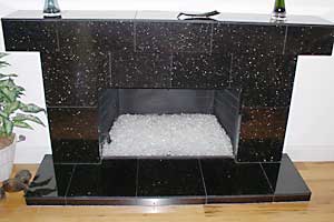
The human eye requires contrasts for visibility and legibility. Contrast creates visual interest and helps deliver accurate information. Colors that are close in value tend to blur together, and their borders "melt." Colors of contrasting values stand out from each other. Darker glass colors tend to stand out more when the inside of your fireplace is painted a light color, such as cream. Lighter colored glass tends to look best against a black background, which is the inside color of the majority of the fireplaces on the market.
Saturated and unsaturated colors can also be considered Contrasting Colors. Picture light gray and black together, or dark midnight blue and baby blue. These also count as contrasting colors.
Keeping this all in mind, take a look at the fireplaces below. Which one looks more appealing?
I think enough has been said about contrasting colors. By using complimentary colors along with contrasting colors, you will get the wow factor you are looking for.
|